One random guy's opinion (and a long-time K9 user):
Little UI design changes are NOT what you should be spending time/money on; they are a waste of effort given K9's already strong usability. I acknowledge it's your time/money but this does not make the app any more appealing. I know I sound like a broken record [1] but, at minimum, I believe Thunderbird could take quite a few users (who prefer privacy-focused apps) from both Google and Microsoft (not to mention 3rd-party apps [2] [3] [4]) by integrating functionality at the local level. This would be a considerable (IMO) differentiation in functionality. I will continue to use Outlook until there is a significant justification to switch to Thunderbird. And until "Thunderbird for Android" is significantly differentiated in functionality (i.e., ignoring UI), it will remain branded in my mind as K9.
- Signed: someone who still calls a tall building in Chicago as the Sears Tower
On the other hand, I can't imagine leaving an app for that reason.
As one who fairly loathes Material Design (especially on mobile), I was hoping cketti would fix what's wrong with Thunderbird, rather than Thunderbird ruining the best Android email client out there, which is now looking like an almost certainty.
I'm neither for or against Material Design, but when I used Android, but MD was generally a good sign that the app was well supported, and the devs cared about UX.
When I'd search for an app, the high quality apps were almost always MD. Maybe k9 was an exception, but I'm sure they lost potential users.
Design for me is one of main important on mobile platforms. If the design is bad, is basically a big no for me at least. I wouldn't be leaving because I wouldn't be installing in first place.
I was using Outlook on Android, but I was finding it pretty heavy/slow. Looked for other alternatives, like K9 and Spark, and choose Spark exactly because of the UI/UX.
I get the feeling of wanting a thing you're used to keeping the same looks, but k9 definitely does not have a good user experience. I don't know if the new look will be that, but definitely needs a face lift.
> That's good for mass appeal. Mass users don't want an app which looks antiquated.
That's pretty spot on. Another example is Eclipse. I swear by it, and it handles everything for me. But when I show it to someone the first question is when did it last updated, because it looks very old.
Eclipse releases a new version every three months.
As a short-time K9 user I disagree. You have to pick between the display name and email of senders. There is no way to show both. This is because of problems with the UI design that risks being misleading with malicious names.
The think there are also lots of UX improvements that would be great. Right now the threading UI is awkward. I'm really glad that swipe actions and swiping between messages have landed as well.
I like K9 but I can definitely see the benefit of better UX.
Learn how it works? It's a rotary phone! Just turn the disk the appropriate amount for the number you're dialing and loose. You could train a chimpanzee to do that.
You've rather missed my point, I think: an unfamiliar or aging look over what is a common interface is a huge problem for gaining new users.
Further, I have witnessed people not understand rotary phones. Plunk one down in front of 10 teenagers and I would wager few indeed would intuit it immediately.
Ah, I see. Well, if you were to ask me whether I think a group of teenagers is smarter than a chimpanzee...
Regardless, on the topic of drawing new users, if the users truly are "new", then any look will be unfamiliar to them, but yes, luring users over from competitors may be tricky.
I don't really know about the dated look, though. For example in computer UI design we had flat, then went shapely, then went flat again. It reminds me of architecture: there is always the disconnect between people who like an older style (like when Classical Mediterranean architecture came back in vogue and we saw a bunch of public buildings being built with all pillars and triangles) and people who want some kind of new experimental style (like when Jugendstil started appearing).
There is always a balance that can be found between finding a presentation that aligns with market trends and a presentation that stands out and draws attention. It's up to the people running the show where on the axis they decide to plant themselves.
"Well, if you were to ask me whether I think a group of teenagers is smarter than a chimpanzee"
Well, your example was training a chimpanzee to do it vs. can teenagers use it without training. And I think they can and maybe even think it is cool, but unless you want to harness that coolness retro factor it makes 0 sense to use a rotary phone for actual use. It is way slower and therefore less efficient. But of course it would beat a modern phone that just looks cool, but only randomly works.
Which would be my requirement for any tool. Functionality first, looks second.
Why does an open source project need to lure new users? Especially at the expense of limited dev time when there are actual security features in the issue tracker?
"Why does an open source project need to lure new users? "
To get some traction and momentum to actually become a serious alternative. New users can also mean new funds and not just more work(like it should be), like for example the blender foundation is proofing that this is possible. Make something that really works and once some actual buisnesses are using it, there will be ways for funding it.
It's slow and tedious to dial numbers with many high digits in them. And there's no quick dial function for commonly used numbers. Both of these things directly impact UX.
"Intuitiveness" is AKA "resembling the current norm" when it comes to UX. Updating an aging UI to fit current patterns makes it more cohesive with the operating system, attracts more new users, and avoids confusing those new users.
Attempting to paint "strong usability" through the lens of existing users only (the guy who already knows how to use a rotary phone) is a lopsided view of the goals for an app creator.
...and it must also be said that the selection of client software that supports it is somewhat limited. For this discussion, Thunderbird does not. I'd also add that some fairly major providers, e.g. anything based on MS Exchange, and Google's Android client, do their own thing (e.g. ActiveSync).
For myself I'm aware of a bunch of bugs in Thunderbird affecting my experience and I'd rather these were fixed first.
I use Outlook on my Windows PC and transfer all personal contacts, calendar entries, tasks, and notes locally. I would love to move to Thunderbird primarily because "Microsoft bad" but then I'd lose my local transfer functionality (not to mention Xobni - which still crashes every-so-often - but the functionality is worth it).
You can run your caldav/carddav service in your local network, if you are so inclined. You will get local sync, and the client authors do not have to build specific desktop-based tools.
I for one do not want to return 15 years back, to serial/irda/bluetooth sync, having to think about sync, and eventually forgetting. Running a local service is much preferable, with devices syncing themselves as they see fit.
If you have a link for running a small footprint of a caldav/carddav service on my Windows laptop, I'm all ears. I played around using WSL and setting up a NextCloud instance but why do I want to use 2GB+ just to sync?
At the end of the day, I want all my personal events, contacts, todos, and notes on my laptop and able to sync directly with my phone. I'm happy enough with my current bluetooth sync and wouldn't trade it for UI changes.
You might be interested in https://radicale.org/v3.html.
Runs on my odroid board with 26mb memory. The documentation is particularly good. I've used it as a replacement for the Synology CalDav and CardDav services.
It's very easy to install and does not require a DB. As a bonus, it stores everything as files which can be read and edited manually. It does require python.
I had played with it for 2 days before I gave up. I don't remember what specifically wasn't working properly but it didn't. Even if I had gotten it to work, syncing between a Windows PC and Android device should not require that level of effort.
Personally, I'm using a small Synology NAS and the Contact and Calendar servers that Synology provides. It solves the problem for being a host for multiple devices, with my laptop not having to be on, or even present, at all times. Also having dns entry helps.
But for running on your laptop? Yes, nextcloud is overkill, it is not contacts/calendar server in the first place. I would look for smaller, more focused tools instead, baikal for example. For another inspiration, you can have a look at what davx5 -- the caldav/carddav provider for android -- tests against (https://www.davx5.com/tested-with).
I've been using Baïkal for about a decade. I have it in a docker container on my home lan. Android and iOS transparently and gracefully tolerate the server being unreachable outside the house.
The main issue is that I only touch it every five years or so, and at that point, I've forgotten what it is called or where it is running!
(I use synology's HyperBackup to E2E encrypt + backup it and a bunch of other docker containers.)
To avoid syncing my calendar and contacts to the cloud, I'm using wireguard as a always on VPN on my phone, to connect to a locally running CalDav/CardDav server. Wireguard on Android can be setup to only affect specific apps, so my DavX app is the only one using the VPN.
They're improving the email display by reducing the amount of space showing the actual email?
By very rough measurement it's reducing the email display area by about an inch, dropping it from 4" to 3". I really don't want that, myself. I open an email because I want to read the email. That's my primary focus. One of the really nice things about the K9 interface has been that so much of the screen gets dedicated to the thing I actually care about (contrast this to the way that web interfaces like outlook.com love to almost relegate the email content to the bottom most corner)
To be fair, they are comparing a best case scenario email in the current UI to a worst case email in the new UI. Multi-line subject, multi-account identifier, tags, external images. So it looks to me like there's actually higher information density in the new UI. A little difficult to tell without a direct comparison of the same email and settings though.
They're also saying the padding “will get tightened up” [1].
I'd also do some other changes though [2], like removing that border around the “Show remote images” button and instead letting it bleed to the whole panel (a trick I've first seen in the Telegram app).
Yeah, I do think they had a bit of a faux pas with this showcase by not showing like-for-like differences. The first email didn't have multi-line subjects or anything like that, so it's hard to compare the two and see why the update might actually be better.
yeah I was irritated by that as well, it makes it much harder to compare the designs. I think I prefer the new one though, the old one does look a little clunky
I agree. Design updates in email clients are not that important - unless it actually also improves usability. Unfortunately, most apps just want to look fancy, not focusing on functionality.
>I really don't want that, myself. I open an email because I want to read the email.
You have a working finger and can scroll the small amount necessary to do that. More comfortable properly spaced out/laid out UI/UX is generally ideal.
They should, though (at the very least) just let the padding/margins be configurable for the people who seem to care about this. No reason we can't have a middle ground approach.
Any mail client (web, mobile, or desktop) that does NOT display the fully-qualified email address (FQEM) next to the "UTF-8" fancy name gets a hard PASS from me.
Such FQEM should ALWAYS display the fully-qualified email address.
I am looking at all the email clients so far. (Please correct me as I would love to be slightly wrong).
I think I can safely speak for all tired people that we are tired of spam.
This sounds like the type of thing FairEmail might have as an option. You could also have your email server change the fancy name to an ascii name so any client would display that.
But, it is still not a default always all fields of an email address that we all need to have to help end-users make an inform decision as to whether it is spam or not.
A reasonable compromise I've seen in some clients in the pass is to show just the display-name when the from address is in the address book and the FQEM along side it otherwise.
Showing the FQEM is of less help than one might think because people often scan over it in a list.
It is a new acronym term in attempt to break free of the spam industry stranglehold on spam.
You should also know who you are getting your email from instead of trusting other people putting in "their" name in the encoded-words (outside its addr-spec).
Here are three killer features that would be a much better use of design/developer time:
* Give me a way to filter email based on the ORIGINATING SERVER, not the advertised one. I.e. give me a way to filter stuff coming from from bunchofalphanum.something.else.salesforce.com that is relayed for somedomain.com with good domainkeys << This will make email useful again.
* Give me a way to quickly unsubscribe from marketing emails in the email list view. (last I looked couldn't do that in K9 or TB for android)
* Give me a really nice threaded view with my responses inline inbound messages as an option.
This isn't about thunderbird specifically but I can't understand why companies keep making this mistake. They (1) mistake removing legitimately useful (sometimes even critical) features for "simplicity", and (2) copy their competitors, often badly. They also never seem to properly think out or test there changes first.
Can't they understand that people will just use their competitors because they can no longer use their app thanks to (1) or because they no longer have a reason to (2).
Mozilla fell for this. Gnome fell for this. Is it really all for the sake of maintainability? At what cost?! I just don't understand it. Can someone explain?
Edit: Just looked at TFA. At least the author seems open to user suggestions and feedback. That's much more than what other projects are willing to do.
I've used K9 in the past for its functionality but I switched back to the Gmail app because the UI wasn't very good. I got the feeling it was designed by and for programmers rather than for a good experience.
I'm sure most K9 users will lament the change and demand (the option) to undo the redesign, but I personally consider this to be a massive improvement, big enough to give switching back a go.
I just hope the users who prefer the old look will have the ability to use a fork/alternate version so that they won't be forced to adopt the new UI, perhaps one that only receives the bare minimum amount of maintenance to keep current features working for those that need them.
Eye candy is definitely the appeal of a commercial app. It should not be the appeal of a technical and sophisticated app. And that is what K9 was to so many for so long. The only reason I left for outlook is because I was able to fit more information in a small screen and because my workplace migrated to Exchange which was outlook exclusive.
> Eye candy is definitely the appeal of a commercial app.
First of all, I don't think "eye candy" is a fair way to characterize UI/UX changes as they often make the software easier/faster/more pleasant to use.[0] Second, look and feel is important for adoption; the fact that the app is "technical" does not matter. Regardless of your audience, all else being equal, an app with a polished UI will be perceived as better than one with a dated design. Third, what makes K9 more "technical" or "sophisticated" than any other email client, to the point that you think it should be treated differently?
[0]: Yes, I'm aware that it can go the other way, but K9 is a great example of an app that could use a UX makeover.
FOSS apps and software were not optimized for adoption, but as a healthy alternative to further an ecosystem of open development and continue progress when others halt. The idea was for the next generations of software to be able to take the same open development and further it with various appeal to differing subsets of the masses. This includes those who want pretty apps. Or those who want UIs optimized for particularly unique workflows.
K9 is an example of an app that needs to update their UI. But it is also an app that needs to take its great set of features and innovate a little further on them. Commercial apps optimize for eye appeal, because those are the lowest of the hanging fruits, They also skew the design opinion towards the generic and easy adoption, which is why the more technical first-adopters get upset at every UI change.
Users with more complex needs are using K9. And yes, I am aware other apps are catching up.
> FOSS apps and software were not optimized for adoption, but as a healthy alternative to further an ecosystem of open development and continue progress when others halt.
I don't see why you can't have both? It seems silly to say that FOSS as a category is not optimized for adoption because there are plenty of widely adopted counterexamples like Linux and Firefox. And in the case of a mobile email client—something that a huge portion of the population uses—why can't/shouldn't it be a daily driver for non-technical users?
> K9 is an example of an app that needs to update their UI. But it is also an app that needs to take its great set of features and innovate a little further on them.
Unless you have unlimited resources, build for a single audience. And that means you are making your app opinionated to the needs of a group. So no, you can't do both.
However, Foss means Others can build the app differently if they wish.
I still hate the ribbons. I go looking in the top "file - edit - view - [...]" menus for things that used to be there, find them absent, and then have to go play Where's Waldo in the damn ribbon. Even in Explorer, these days! And the ribbons themselves just seem like a jumble of button sizes and placement with no rhyme or reason.
That is a pretty good place to have orientation buttons for printing. Especially if it's in the exact same place in practically every program that can print. Programs like Word managed to have toolbars for all kinds of things before the Ribbon interface, and that was usually fine. Often they even had printing-related buttons (in addition to file -> print).
One big difference is that these tended to be more compact and one-dimensional. There's a lot of eye movement involved in scanning a ribbon toolbar, looking for something, since you have to scan both up-and-down and side-to-side; and the mixed-size icons, mixed icons-and-labels that don't segregate icons and labels to their own rows or columns but jumble them together so you're always scanning a mix of both, and inconsistent placement between programs make the whole thing feel slow and frustrating.
> I go looking in the top "file - edit - view - [...]" menus for things that used to be there, find them absent, and then have to go play Where's Waldo in the damn ribbon.
My experience in Word improved dramatically the day I learned the Alt-Q shortcut for just asking for what I want instead of combing through endless menus.
No, I don't think I will give it time. UIs should nearly never be changed. It doesn't matter much whether or not it's an improvement. Don't monkey with other people's tools.
I've said this before, but it's worth saying again:
Define "improvement".
Because the best UI (as in unquestionably the absolute best) is the UI that you're already an expert with.
Can there be better UIs later? Yes.
Can there be better UIs for new customers? Yes.
Can there be a better UI than the one you're already an expert in? NO! At least not until you do the work to become an expert in the new UI all over again.
At a minimum, you're asking users to trust you that re-learning their UI will ultimately be a better experience for them. Because it will absolutely suck for your existing user base when it first changes (this is why UI changes are almost exclusively met with negative backlash from the current users).
Can you do that? Sure. Do companies do it often? Nope. The vast majority of the time, the UI is changing for one of two reasons:
1. The company believes the new user experience is better with a different UI. They are actively trading existing customer satisfaction to improve metrics around new users.
2. The company believes they can drive users to new features with a new UI. They are actively trading existing customer satisfaction to improve metrics around new features.
Neither of those are compelling reasons for a new UI from the perspective of an existing customer.
Broadly - they might still be an acceptable trade for a company on the whole. But don't expect happiness from your current users, and be very wary of the churn and brand loyalty you're burning by making the change.
Don't believe that was worth saying twice quite frankly you're the only one trying to redefine "improvement".
Here's a very simple non-UI example for you. You have learned to cut an onion one way. It takes 5 minutes to cut it that way. Someone else comes along and tells you that you can cut it this other way, and now the process only takes 30 seconds. Is there some learning here? Yes. Are you suddenly incapable of cutting onions or are no longer an expert in cooking just because you learned a faster way? Absolutely not. But overall it is an improvement including any learning process.
Existing customers who remain stagnant because they are terrified of any change are customers who eventually leave when they're marketed to by someone else. It's truly that simple.
Don't get it wrong, this isn't an argument in favor of mindless UI changes (and frankly Thunderbird's changes are garbage) as bad UI updates do exist and should be argued against, but this idea that improvement doesn't matter is so beyond absurd!
So Windows 1.0 was a "modern", "clean" (i.e. flat) user interface, like Windows 10. They have a substantially different color scheme and a substantially different layout preference, but we can pass them off as theming and pretend this matches.
It had a panel at the bottom of the screen (showing background apps) and tiling windows for non-backgrounded apps. Windows 10, by comparison, prefers you to run maximised apps and has a panel showing all apps, including some that haven't been launched. Despite the fact that a user experience for Windows 1.0 and Windows 10 could be roughly the same, the Windows 10 user is not required to maximise their window and can have multiple, user-managed windows. This is vaguely similar, but I think the dissimilarities are starker than the similarities. Especially since the panel explicitly draws inspiration from other operating environments - if it is similar, it is because of a common language rather than because of heritage.
Windows 1.0 made use of menubars to hide their functions or to make them available. In Windows 10, the menubar is essentially deprecated - it still exists, but most Microsoft/inbuilt apps use ribbons or hierarchical page-style apps (I don't know what to call them - apps whose UI draws more on mobile apps than the desktop tradition).
Windows 1.0 exposed your computer to you in terms of the file system, kinda like the Mac did. Your prime UX helper was the MS-DOS Executive, which was the predecessor of File Manager/Windows Explorer. By Windows 3.0, this system was essentially abandoned and applications were presented separately from the filesystem, first via the Program Manager and then by the Start menu, eventually adding the taskbar/panel into the mix. This system remains to this day. I think this is a massive difference, it is insurmountable. The idea that the filesystem is a scary interface means that your operating system mediates between you and the stuff on your system, rather than being a tool for accessing it. Your C: drive becomes Windows' private database that it uses to store your programs and data - effectively a local cloud, making the transition from "your computer, your files" to "Microsoft's computer" obvious. It was clearly no great conspiracy - Gnome and KDE and XFCE, to say nothing of all mobile phones, do the same thing; it was a natural evolution in making computers easier and safer to use. But the ramifications of the change are significant, and the implications for a comparison of Windows 1.0 and Windows 10 are significant. However, I think you're mostly comparing Windows 1.0 to Windows 10 in comparison with Windows 1.0 and perhaps Windows 2000, and in this regard, yeah, sure, maybe we have to "price in" this change.
Windows 1.0 made very limited use of graphics and animation. Windows 10 pretty much is scared that you're illiterate (fair enough maybe, we can process graphics pretty quickly compared to text). It's certainly worried that you might have an attention span, and does everything it humanly can to prevent that. I think the difference between Windows 1.0 as a "good faith" tool and a work in progress, versus Windows 10 as a deliberately distracting entertainment device, designed to prevent you from doing what you want today, is also a massive change. Understating it does us a massive disservice.
If you're into the idea of thunderbird on android then you'll be delighted to hear that Mozilla seem to be hiring for this work. I have no affiliation with them, just thought some in the crowd here might be interested. :)
If Thunderbird is replacing K9, it better remain on F-Droid. Mozilla doesn't publish or optimize officials browser builds there so they can end up lagging on release which can cause security concerns.
I am a Thunderbird user on desktop but I had been using Blue Mail on Android for several years and had been pretty happy with it. I may switch to Thunderbird when they have the sync feature implemented.
I used blue mail for years and recommended it to my wife and some of her friends. Everyone likes it. I, however, moved to fairmail and been very happy with it. Reason: its foss and much better than k9. Have a look at its feature set and UI.
K9 already exists today if you want to switch which is "thunderbird for android" with a different name, but what do you mean with sync feature? That it shows notifications, or fetches all your email for offline reading or so?
Basically, Firefox Sync allows you to sync certain things across your devices (bookmarks, tabs, etc) and they are going to implement similar functionality in Thunderbird.
Reading about a Thunderbird version for Android got me exited, because I am a big fan of the desktop version (actually, I donated a few bucks this week). However, on Android I used K9 for years, until I noticed how unreliable it became. I switched to Outlook and it is okay.
When I saw that the Thunderbird app will be based on K9, the excitement vanished instantly. I really hope they will invest into the reliability issues. Judging from the play store comments, it could be worth it.
I don't know when you used K9 for the last time, but it has improved in stability greatly in the last ~two years. It's true that some years ago it went downhill for a while.
Kudos to the team. Looks great from the preview. I hope there is an iOS version in the works. I would love to use this on my iPhone instead of the default mail app.
Fairemail is consistently better in every regard than K9 and I don't think the people that brought us the thunderbird desktop monstrosity are in a position to be deciding changes to an at least mostly usable client.
Wish there was something even remotely close to K9 or Thunderbird was available for iOS.
I would love to have K9+Thunderbird on iOS as a paid open source app. None of the iOS mail clients offer anything other than the surface pretties
One feature I need badly is ability to set any username on my domain. Catch all works fine but without the ability to send emails as a reverse “catch all” the feature and fight against spam often falls flat. (I think only Fastmail client has that option but then it will be another provider specific mail client)
Last time I used K9 was in ~2020 (then I discovered FairEmail) so I'm not married to the old UI in any way, but from the before and after screenshots, this seems like a regression:
1. Firstly, why did this need rebuilding? I know they want to rebrand it from K9 to Thunderbird and I'm happy that the thunderbird team isn't going to be caught up for years trying to rewrite what already exists while K9 gets to benefit from a comparatively very, very well-known name. But what was so fundamentally broken here that it needs to be entirely remade? Could just have applied a color scheme.
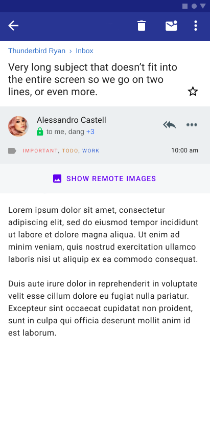
2. I had trouble recognising the subject as part of the email (but only in the new layout). I was looking for it and looking for it... and it turns out banner blindness strikes again: it's above where I thought the email started. No problem, that's an issue on day one only, people will get used to that soon enough.
3. The attention grabber on every email is going to be the purple-colored "SHOW REMOTE IMAGES" (caps theirs). I can't recall the last time I've shown remote images. Perhaps a Domino's email where they briefly hid the discount codes in images in 2016/'17? Anyway I hope that can be moved into a menu as it apparently was before.
4. The date has like ten characters available to it. What happens when it's not "10:00 am"? This seems designed by a designer, then the coder comes in and finds that "yesterday" still fits but "2022-07-03 22:47" is going a problem. That means either making design decisions single-handedly and annoying users who were promised (and gave input on) a different design, or going back to the design team and the mailing list for input and on lord no let's just hide the time and get something done today
5. There's suddenly a lot more space on the side. Hope that's configurable, I don't have a large phone to begin with. Probably just me.
6. The text seems bold and blurry. Probably the screenshot just isn't shown at 1:1 size (old layout looks crystal sharp though?) and the bold might be the email in question using a bold tag. One can hope.
7. Recipients hidden when the field has literally ONE word in it ("Alessandro"), there is space for at least another same-sized name and a blank line below. I bet if you click that tiny expand button (good luck not pressing on the user and composing an email to them instead), nothing in the layout has to change to show the three other names. This would annoy the heck out of me if I'd use K9 for work where more than one recipient is common.
8. It says "Thunderbird Ryan" on top. Is that me? Is it reminding me who I am / which account I'm using, and using another two lines of text for that (one for the text, top and bottom each like half a line's worth of borders and spacing)? Sure hope that's default hidden if you have one account only and configure if not.
9. What does a green lock with "OpenPGP" mean? Was the email encrypted or signed? Both? Either? Is transport encryption indicated? Can that also trigger the green lock? I was going to ignore this but was looking for something positive to close out with, scrolled down, noticed the pgp overlay screen and that it's also not mentioned on there, and thought that this is an essential UI element if users are ever going to know what the lock icon guarantees, so UI space needs to be in the mockup if you're drawing what the detail views are going to look like.
10. "Alessandro Castell..." is as far as it gets for the sender in the new layout before cutting it off. On the old layout, "Edgar W. Dijkstra" fit with two thirds of the line still empty. There's something to say for putting more on that line, but not even fitting one name in a field where a name is supposed to go? Interesting choice. Hopefully you know your correspondents by full name already or you'll need to open up another view if you only know them by last name, want to address them as Dear Mr. Castellsomething in a reply...
Some of these are not going to be an issue for most people, but I've tried to look for clearly positive changes and haven't really been able to identify any. Likely most people will run into at least one of these. I wonder still: why in the first place...
I've seen something similar happen when I answer to an email address that's not configured.
Let me explain better:
  - In K9 I only have configured to receive and send from my main address. Let's say it's 'main@domain.com'
  - I have several different addresses to my main address. Again, let's say it's 'secondary@domain.com.'
  - If I receive one of those forwarded emails and reply to it, in the FROM you'll find 'secondary@domain.com'
  - It will go to the outbox, but never get sent... but without any error. So you never know it wasn't get sent unless you check the outbox, and you won't know the reason.
I guess it's because there's no outgoing email profile for secondary@domain.com and it's lacking some sort of error management for that.
I can never get K9 to send email unless I manually sync right after. Some not very useful error pops up, then one sees the mail still in outbox, and the solution is a refresh.
My own yunohost-based mail server, an ISP mail box, two university mailboxes (zimbra).
I mainly like that it's FOSS and on F-Droid (no google services for me). I haven't used Gmail in years, but IIRC, no annoying smart replies or features I don't use like gdrive, photos, hangouts... denser UI, reliable notifications, unified inbox, good multi-account support, support for gpg. It generally gets out of the way. My mother asked me to reinstall it after she changed phones.
I could use better support for nested IMAP folders, better search and syncing of said folders.
Probably a better config workflows for non techies? Though that's pretty good already.
I would really like it to be easier to customize the sender mail address, as I make extensive use of +aliases, and would have to create a new identity each time.
I use it with Fastmail for my main email + calendar + todos, and I use it with Purelymail[1] for simply emails with no nonsense.
Both accounts, once setup, just behave.
On the groupware front, I use DavX5 and ICSx5 to do to calendar and todo sync to fastmail, and Tasks.org [2] to do the front end for the todos.
For my work accounts, I use the nine email app which lets me authenticate to exchange active sync without needing a work profile on my phone so I can see emails, calendar, todos etc.
I'm using the old K9 (before the pre-Mozilla redesign saga) with three POP3 accounts on the mail servers of the registars of my domains. I check my mail on my phone, read it, delete the unnecessary messages, eventually download on my computer (Thunderbird) and backup.
The old UI is very good at this worflow and that's why I ended up using K9. The new UI with the unified inbox is bad at it. This K9/Thunderbird? I should download it to understand how it works. Probably like the new UI but who knows.
Feature-wise, nothing really caught my attention compared to Gmail. At the time that I switched, however, K9 Mail was noticeably snappier for me, had no Google Play Services dependency, and weighed about 7MB to Gmail's 50MB (at the time).
Migadu has been perfect for my needs. The basic plan at $20/m is more than enough and it's basically dirt cheap. If you're a student you can even get it for half the price.
I really like their lax and understanding limit policy.
Looks like "Basic" (Standard) is now $29 which even at $20 I thought was rather high having never heard of them before. After reading through their website and pricing page it's pretty interesting.
Instead of paying per "user"/"email address"/etc you pay for usage (sent/received/storage). With this you can add as many domains/email addresses/users that you want. If you have 20 domain names where you just need need 1 mailbox it costs the same as 1 domain name with 20 mailboxes since it all comes down to usage.
If I wasn't so deep into google workspace (or whatever they are calling it this month, G-suite/g-apps/google apps for your domain) and if I had it to do over again I would use this in a heartbeat, I still might but it will be harder to move (need to figure out how to keep docs/drive/calendar stuff on google or migrate it to other services).
Fastmail was the fallback provider I always considered moving to but at $3-$5/user it's a pain to add old/low-volume accounts that still need to be monitored but aren't seeing a ton of use. Migadu solves that problem very nicely and would probably lead to me spinning up new "mailboxes" much faster/sooner because I imagine it's pretty easy to do and then only need to think about upgrading as your usage increases, not just your mailbox count.
I couldn't find a good answer to "does spam count towards your receiving limits", I found a reddit post [0] that says it doesn't and that the limits are soft anyway (which I had already seen) so I'm assuming this is the case or it doesn't really matter in the long run.
Lastly I wish they would offer 2FA though I understand their current reasoning (still need no-2FA/app-specific-passwords for IMAP so does 2FA really matter?). I get what they are saying but it feels like they could implement 2FA for managing/overseeing your account and then have app-specific passwords for each mailbox (maybe 1 main with the ability to create others so you could disable it if you decide to stop using a client/service that you attach to your email)? I could be missing something as I've not actually signed up and tried the service, yet.
My own fully self hosted dns, postfix SMTP and dovecot IMAP over TLS setup. Not something to attempt casually unless you work in network engineering for an ISP and have the motivation to maintain your own MX and email hosting environment for other reasons.
I use K9 with Fastmail. I don't like how difficult it is to search. It seems to involve some complex process of navigating back through the mailbox (from unified Inbox to the actual Inbox of the server) and then running the search locally and then pressing back some unknown number of times until a "send query to remote server" toolbar button pops up, and then I press it and it runs the search remotely. Since it only caches a small proportion of my inbox, I always want to send the query to the remote server - it's likely that I could find the item by scrolling faster than I could find it by searching if it's in the cache. I'd be happy if that button was in any search view instead of having to do the weird and complex dance.
I am willing to tolerate this issue because I don't search all that often. In general, a buggy FOSS app is better to me than a commercial app because it is unstable at any given time but relatively stable over time, whereas commercial apps tend to be stable at any given time but unstable over time.
I use it on some self-hosted domains (all IMAP) but have used it with Migadu, MXroute, and others.
I generally like it more than FairMail (simpler, fewer options that I seemed to need to set). But I have tried to sell it to other Android users, and not having swipe-delete made all of them give up. I'm fine without it, but would probably adapt to it if it was Thunderbird standard; I use the iOS email app a lot too.
I mainly like that it's no-BS, just works, is available on F-Droid, small download, dark theme, import/export for accounts and settings, lots of switches to flip in the settings should I find any of them necessary to use. I expect none of this to change with the Thunderbird rebrand so it's a win for both projects _and_ the users as far as I can see.
I use it with a few different email providers, including fastmail and a self hosted server. Works pretty well for what I need it to do.
The only feature it's missing which hurts is nested folders. All nested folders are displayed in a list structure, rather than a tree, which is a bit of a pain if you use a nested archive (think Thunderbird's Monthly Archive structure).
Oh! I am glad I'm not the only one who has a problem with its search. I wish it would just make it easy to send a search to the remote server instead of hiding it behind so many layers of complexity. If it's a deliberate feature to avoid sending the query to several servers and leaking private info to server admins via the search feature, I think they could make it easy so that there was always the "send query to server" button that brings up a list of accounts that you can send the query to, instead of only making it visible when there's a single account in context (and then only when it doesn't feel like being buggy).
that would actually be... quite good. but I'd love to see more ambition (and community support) for thunderbird. I would like it (or some future converge) to be my RSS reader and, why not, my fediverse client.
that's fine (or could be :-). I am thinking more about syncing the state of differnt mailboxes, local storage on mobile versus desktop, what is read / unread, user tags and other such things. I.e. how to use the mobile and desktop together as different clients to the same email content.
The majority of what you are talking about (read / unread, user tags and other such things) is handled by the IMAP server. eg; I routinely start drafts on mobile, save it, then continue to draft on a computer before sending. Also set flags on mobile for follow up later on desktop. Almost none of this depends on the client itself, it's all stored in IMAP.
Late addition but yes of course the apps must support those IMAP features. They work hand in hand for this functionality.
Presently if you aren't able to do any of the above something is not configured correctly. Some apps have differing opinions on where the sent/drafts/deleted folders should be for example.
Read/unread and tags are all supported by IMAP already so that should be possible for sure. Same with starring/flagging email, any willing mail client could implement those.
The big integration points I see are within special features such as some kind of cross device PGP support, the ability to sync customised "from" addresses, and other features that the more basic built-in email apps lack.
Perhaps the code could be further extended to also support calendar, task, and chat functionality, just like on desktop, but that would take more effort.
- No way of setting up Thunderbird mail folders, one cannot put mail onto SD card as the default.
- Where's all the options such as leaving mail on the (POP) server?
- When in Manual setup K-9/Thunderbird downloaded mail before I had a chance to select never in accessing mail. Doesn't manual mean just that?
- K-9/Thunderbird wants to sync things by default. Can't people at Mozilla realize that the main reason for using this package is that we do not want a repeat/rehash of Gmail! In simple English that means:
We want nothing to do with Google in anyway whatsoever!
Moreover, on some of my rooted phones there are no Google apps—not even their non-spying equivalents such GApps or MicroG which means the mailer must work all by itself as on the PC. It's people like me who will use K-9/Thunderbird, the great unwashed will nearly always continue to use Gmail, so there is little point in developing an email client for Android unless it significantly differentiates itself from the default Gmail.
- K-9/Thunderbird assumes one will give it access to one's contacts (I don't), it has no alternative to Android Contacts. Why doesn't it have its own address book? It's really annoying when it nags about not having access to Contacts. Other privacy-focused Android apps use both Google's and their own address repositories, so why not K-9/Thunbderbird?
- The editor in Thunderbird for the PC sucks big-time (I've whinged about this for years), this one in K-9/Thunderbird could hardly even be called an editor, it's only really an SMS messenger text handler it's so primitive. I know, many just want a basic or ASCII-like text editor—and it seems so do Thunderbird's developers (developers you are developing for others not just yourselves). Remember also that Android encompasses more than just smartphones, tables etc. which I use with a Bluetooth keyboard and mouse (K-9/Thunderbird under these circumstances looks and works like something out of the Dark Ages)!
If you cannot fix the editor then allow users to use an external one!
- Where's the multiple accounts setup (if it's there then Mozilla you've done a good job at hiding it)?
Three days ago I had to set up Thunderbird for the PC Windows on a new laptop and it was a damn time-consuming pain. Transferring email from one PC installation to another is something that obviously Thunderbird developers never do (probably because they're all using Gmail and The Cloud on their phones, thus they never have to bother). To make matters worse, I've promised to do the same for a colleague who cannot do so and I'm dreading the fact.
To put this K-9/Thunderbird offering into perspective, it's worth considering what is wrong with the PC version—and here I'm not talking about some old version but the latest 102.5.0 and current beta 108b2. That's a tall ask because it'd take many, many pages to describe the problems adequately, so I'll just outline a couple problems that bug me and others (common ones collected from help desk logs, etc.).
- Thunderbird, like Firefox, has made a reputation for busting add-ons/plug-ins; every new version busts something, and it's invariably done in the name of security. Instead, of Thunderbird's developers either sandboxing add-ons or provide an option 'add this add-on at your own risk', they take the approach of an authoritarian dictator and simply kill any of them that doesn't take their fancy—then, as so often happens—the only plug-in that does a specific job no longer works (this is yet another example of why software development can't rightfully be classed as true engineering—real engineers don't take away, say, steps from a building after installation so people cannot use it!).
What developers of both Thunderbird and Firefox forget is that the main reason why users install add-ons to these programs is to overcome basic and often very fundamental limitations in their design in that they are missing when they ought not be, these fixes are often considered essential to users often more so than than security considerations/fixes (it's certainly so with me). We find it very annoying when some important feature goes missing in an upgrade. Furthermore, Mozilla developers rarely bother to placate irate users, their arrogant 'it's-free-so-don't-bother-us-with-your-problems' attitude means one doesn't even get a hearing when one complains.
- Thunderbird has a 'feature' that allows the user to change or add profiles called profilemanager. You'll never find it in the menus because it's just not there. Instead, after searching or fossicking around on the web you'll find that this cryptic, poorly-explained feature can only be reached from a 'switch' on the Command Line—yes you read correctly the Command Line! Until recently, if you deleted an old profile then you also deleted your mail files folder and even now it's still quite possible to do because it's a horrible, ergonomically unsound, bit of afterthought coding that's hung around like a bad smell for years (yes, like other boring but essential bits of Thunderbird it's not been fashionable enough to re-code and or fix it).
The ergonomics of Thunderbird's profilemanager is so terrible that I'd like to see the culprit(s) in the stocks for a few days so everyone got to know those who make a crime out of coding. All future versions of their CVs with the fact compulsorily entered therein would round it off. The profilemanager only does part of the job, one has to go into the Accounts management and manually patch the directory where one's mail is located (that is unless it's in the default location). Anyone who has to set up multiple accounts and has to have the mail on different drives and or in different directories can spend hours trying to sort out the many problems. Multiple accounts are all jumbled up in the prefs.js file, and just looking at it one can immediately see adding multiple accounts was also an afterthought. The obvious thing to do would have been to separate these accounts into separate files then one could move them about to different machines etc.—even for maintenance it would save a great amount of time.
Looking at the 'time modified' timestamp on my files I note that it took me 7 hours and five minutes to reinstall the accounts on the new machine (BTW, there are only four accounts involved, I didn't have time to do them all at the time).
- Much time is wasted installing Thunderbird because developers think it's a good idea to ensure that you cannot set up mail offline! If you want to set up mail manually, and you have all the server parameters tough luck—you have to have an internet connection. Yes, I know mail setups have to be completed online but if one could set up the mail account offline beforehand then it'd be only a click or two when one went online. The question is why hasn't this nonsense been fixed years ago.
- Moreover that first account becomes the main account and heads the tree whether you like it or not (as it's the first account it's likely to be used more often and likely mistaken (very problematic if one gets one's work and home accounts mixed up)). The only way I know to change it is to set up the main account then 'nuke' it later. After checking that the account works shut down Thunderbird and edit the prefs.js file with dummy information (it's tedious as there are multiple entries). The dummy account I created is no.mail@default.nul. After that recreate the original account, it will now be further down the tree. If there'd been a competition to make it harder for the user then Thunderbird developers would have had difficulty beating their efforts with such stupid shenanigans as we've seen here. To put it bluntly, Thunderbird's ergonomics and program design is a fucking shambles and no amount of dressing it up with new features will fix it. What's needed are bugs and limitations fixed first.
One quick point to finish: the mail editing window cannot be docked with the main window. Why the hell not? If this is considered undesirable then just have it as an option for those who want it.
There's so much wrong with Thunderbird that I sometimes wonder if Microsoft employees are working for Mozilla as Trojan horses! What better way to bring open software into disrepute. And the proof's seems to be in the pudding: in recent years with Mozilla developers doing what they damn-well please instead of fixing bugs and boring but necessary work, it's little wonder Mozilla has fallen from grace.
Many others and I would be very happy if Mozilla offloaded Thunderbird onto others—those who know what they're doing and who actually understand what users want from a modern email client.
I think it's a weird objection because it's a work of fiction whose content is irrelevant, but the post-revamp screenshot has an email from "Alessandro" but an feminine-looking avatar, and there's the keys for a "Darlene" who looks masculine and a Armando/herman who also looks feminine. Most of us can smell a random record constructor when we're near one but apparently not everyone.
Little UI design changes are NOT what you should be spending time/money on; they are a waste of effort given K9's already strong usability. I acknowledge it's your time/money but this does not make the app any more appealing. I know I sound like a broken record [1] but, at minimum, I believe Thunderbird could take quite a few users (who prefer privacy-focused apps) from both Google and Microsoft (not to mention 3rd-party apps [2] [3] [4]) by integrating functionality at the local level. This would be a considerable (IMO) differentiation in functionality. I will continue to use Outlook until there is a significant justification to switch to Thunderbird. And until "Thunderbird for Android" is significantly differentiated in functionality (i.e., ignoring UI), it will remain branded in my mind as K9.
- Signed: someone who still calls a tall building in Chicago as the Sears Tower
[1] https://news.ycombinator.com/item?id=31728531
[2] https://play.google.com/store/apps/details?id=com.callicia.b...
[3] https://addons.thunderbird.net/en-us/thunderbird/addon/mypho...
[4] https://generalsync.com/en/