I don't get it. Is a single huge browser window seriously considered "good" now? I thought that the whole point of the "useless" green button in Mac OS X was that you should never maximize anything. Two browser windows side-by-side are much more useful than one of twice the size. Are we really moving away from multitasking on the desktop?
I think most people moved away from it before they knew they had it, when their copy of Microsoft Works for Windows 3.1 opened up in a maximized window.
Apple is heavily promoting use of gestures, multiple desktops, and other OS features to promote fast switching and passing of data between running full screen apps. It's different than the pile-of-windows approach of the last few decades but the intent is still to have a ton of user-opened programs running and interacting. I think casual users genuinely prefer full screen apps, even after 20 years of pro users trying to lecture them and slap their wrists over the potential they're ignoring. Lion seems to be trying to give them their full screen, while also teaching a "safe" feeling way to multitasking and present a bunch of apps.
I'm not sure gestures are ever going to be more than a power-user feature. They are the keyboard shortcut of touch devices. My girlfriend still uses the browser scrollbar even though I've showed her the awesomeness of two finger scroll many a time.
The ipad disproves your claim about gestures. Gestures work just fine, as long as you do them on the screen itself and make them tightly correspond to real-world behavior. The usability problem occurs when the display and the touch interface are decoupled. The intuitive aspect of direct manipulation hinges on the manipulation actually being direct.
The trouble with mice is that they are a double proxy. You move the mouse in absolute terms, the mouse moves relative to a surface, and that relative movement is translated to the screen. The mind after a while abstracts away the mouse into a piece of your hand, so touchpads aren't really an improvement over mice, because you're just making relative movements on a proxied surface in both cases. In my experience the big usability issue with touchpads vs mice is that the area for relative movement is too small, requiring frequent repositioning. Apple gets it right by making the touchpad surface huge, so that you reposition your fingers less.
I expect that the current form factor is just an in-between until most computing devices look like ipads with external keyboards, with the mouse reserved for precision work (or perhaps we'll have dual finger/pen touchscreens).
Given the prevalence of wide screens, I really wish Apple would have embraced dual split-screen application windows in addition to full-screen applications. As it is, we're still stuck with hacks and workarounds.
Regarding the use of horizontal space: This is what the Reading List feature of Safari 5 is for. (Example for comparison: http://i.imgur.com/x2tkl.png)
Tabs are really only supposed to be used for things you're actually looking at simultaneously; any time you're just middle-clicking everything on a page (e.g. the HN frontpage), in order to queue those pages up for reading after you close the index page, you should be putting them in the reading list instead. It's kind of sad that Apple hasn't made a larger push to get people to notice it; it's a much better solution for the bottom-80% of what people use tabs for today.
Things you might not know about the Reading List:
1. It has quite a bit of accelerator support (you can put any link into the reading list by Shift+Clicking it; you can put the page you're on into the reading list with Command+Shift+D; and Command+Alt+Down is "I'm done reading this; advance to the next thing in the list.")
2. The reading list (as part of your bookmarks menu) gets iCloud-synced. Your open tabs don't. That alone was worth consciously forcing myself to re-learn my "eh, later" behaviour, because now I can just forget what I had "open" and read the rest on my iPad/iPhone/etc. (I suppose this might be why it hasn't been advertised much as a feature; they might be waiting to use it as part of the iCloud release pitch.)
---
On a separate note/rant, regarding the use of "tab groups": it seems like the author simply wants to re-invent the Springboard/Launchpad-style application management paradigm within the browser. Why bother? I don't want to have two different ways of managing my applications, depending on whether they're "web" applications or not. I want my applications in Launchpad, and my running applications in the Dock, with notification badges on them. It shouldn't matter that Gmail requires Webkit-et-al, just like it shouldn't matter that an app requires Java.
Safari, just like Mobile Safari, should simply have an "Add To Home Screen" button and be done with it. Apps that have been added as such should perhaps be able to access extra resources. (Their HTML5 offline-browsing manifests should be automatically downloaded, for one; they should have accelerated WebGL enabled, with shader support, for another; and this would also be an obvious place to adopt something like Google's NaCl.) I'm guessing, though, that we sadly won't see any of this support, because anything that integrates with the OS well-enough as a web-app is something that doesn't have to make a Mac App Store app instead.
I just booted up Safari (for the first time since I installed Lion) and tried out the "Reading List".
The main reason I don't like it is that the reading list doesn't load the page until you click on it. When I create a tab, it loads and opens the page and it's ready when I navigate to it. I navigate to a reading list page and I have to wait a non-trivial amount of time for the page to load.
I understand why you would do this for a mobile browser (to reduce data charges for pages that might never be opened), but that doesn't matter to my desktop machine.
Safari could mostly fix this by preemptively loading the neighboring pages in your reading list. Until then, I'll stay with my tabs in Chrome, thanks.
> The main reason I don't like it is that the reading list doesn't load the page until you click on it. When I create a tab, it loads and opens the page and it's ready when I navigate to it.
If you've ever gone on a Wikipedia/TVTropes/Everything2/other-heavily-intralinked-website-here binge, you'd be thankful for the fact that the reading list doesn't load the pages you hand it until you're actually reading them. 3000 open tabs will kill any web browser I'm aware of; 3000 reading list entries is just 3000 items in a list.
I'm not sure I understand your reply. I think that officemonkey meant that in a serial list of "things to read", Reading List could cache the preceding and succeeding pages relative to the particular item you're on so that as you complete one page you can immediately jump to the next/previous page.
I agree, however, that Reading List does not address the "random access" approach to research, which is more along the lines of using tabs simultaneously, as intended.
> Tabs are really only supposed to be used for things you're actually looking at simultaneously; any time you're just middle-clicking everything on a page (e.g. the HN frontpage), in order to queue those pages up for reading after you close the index page, you should be putting them in the reading list instead. It's kind of sad that Apple hasn't made a larger push to get people to notice it; it's a much better solution for the bottom-80% of what people use tabs for today.
I appreciate the time you spent putting together a long response and a good explanation of the reading list, but honestly this seems like broken UX. Tabs and the reading list have a massive amount of overlap conceptually. The only true distinguishing feature seems to be that the reading list syncs. Other than that, it seems like the user is being asked to take on extra cognitive load to decide whether to open a link in a tab or the reading list. There are times when I know I would like to read something later or on my tablet, and that's the use-case for the reading list. Most of the time I just want to open a link now, and that's what tabs are for. If a vertical tab design is better, then tabs need to go vertical. I shouldn't be forced to open everything in the reading list to work around a UI deficiency.
Thanks for the reading list insight. But I'm surprised reading list isn't paired with any kind of note taking system.
I have been dying for a sidebar solution where I can take notes and write while I read a webpage. As it is, I always have Notational Velocity open on the right and Safari open on the left.
I have a 1920x1200 monitor and find that a lot of my web browsing wastes a lot of my horizontal space. Tabbed browsing certainly beats single-window browsing for content aggregation sites like HN, but it's still kind of cumbersome... and there's all that horizontal space not being used. So I wrote clikkit - it creates an iframe and starts loading the page as soon as you click the link (unfortunately, it's up to Chrome how much priority it gives to fetching the page, and it doesn't start rendering it until the iframe is added to the DOM).
I have this option with Chrome 13.0.782.109 beta-m. If you right click a tab, the context menu option is "Use Side Tabs". I just can't remember what I did to get that option to appear in the context menu. I thought I used "about:labs", but that is no longer showing anything. Maybe the feature is baked into this build?
> In similar iOS style, screens should be rotatable and shift their content accordingly.
I have a 24" rotatable screen.
1. The amount of cabling hooked to the screen makes it a pain. The size also makes it unwieldy, and if your desk is anything worse than spotless you'll likely have to move a lot of crap around before you can rotate the screen without shoving stuff around and on the floor
2. A 24+" 16/10 (let alone 16/9) screen is very wide, putting it in portrait means you have your nose in the middle of the screen when the screen touches the desk, it requires significant (and uncomfortable) neck movements in the vertical plane
i do use smaller screens in portrait mode as "side windows" to the main one, but I would not work with a big widescreen in portrait.
And even more so for coding: widescreens let me keep IDE crud (content panes) on the sides out of the main content, and when using a text editor (Emacs) it allows me to view multiple files side by side (or — with follow-mode — multiple sections of the same file).
In portrait mode, I tend to center whatever I'm looking at, but having a wide vertical aperture still makes it a lot easier to navigate a large document. Though it's annoying when I'm reading the bottom of the document and can't center it.
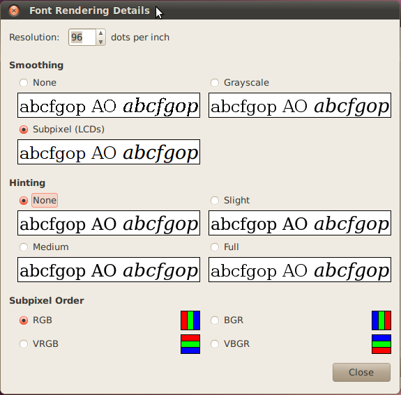
I know nothing about the technical details of font rendering algorithms, but isn't that just an implementation detail? How hard would it be to write a font rendering algorithm that works when each RGB triplet is a vertical line? And having done that how hard would it be to implement a font renderer that switches between the two algorithms depending on screen orientation?
My gut reaction is that well-made typefaces for digital use, which are often designed with hinting in mind, would lose their benefits. For most fonts, though, it shouldn't make a difference whether antialiasing or subpixel rendering is done vertically or horizontal, and I know you can manually specify your subpixel information in Linux.
Edit: natesm posted a response to the grandparent of this comment with a screenshot of the subpixel orientation selection in Ubuntu.
I've read that the RGB (horizontally) allows better rendering than VRGB (vertically) because (at least in the Latin alphabet) extra horizontal resolution is more often more useful than extra horizontal resolution.
Eg. 'm' and 'w' would benefit more from extra horizontal resolution, while 'e' would benefit more from extra vertical resolution.
I tried a ~22" screen vertical for a while, primarily for coding, for exactly the same arguments you made. I switched back because I found I was still only using about as much of the screen as I was when it was vertical - I'm much better about looking side to side than I am up and down - and because I'd rather have two or three windows open side-by-side than one on top and one on bottom.
I have an external 1280x1024 screen, and I've switched it to portrait. I wish I'd done it long ago, as it's perfect for Xcode help docs, and for reading PDFs generally. It also runs the iPad simulator without scrollbars, but sadly only when it's the primary screen.
* For good ergonomics you need to align the top of the screen with your eye level. I couldn't figure out a way to make this happen, so I always had one non-ergonomic aspect.
* Making big saccades (window-to-window) is easier for me when the windows are side-by-side than top-to-bottom. Windows 7's dock-to-edge feature is really convenient, and I don't know of a good alternative for vertical arrangement of windows.
* As someone else points out, the screen is unwieldy to rotate.
I code on a laptop full-time. I know plenty of other people who do so, for various reasons. This is not an uncommon thing, any more than it's uncommon for writers to use a laptop full-time.
it's like this article was written just to prove the relevance of the title text in xkcd.com/934:
"It's fun to watch browsers fumblingly recapitulate the history of window management. Someday we'll have xmonad as a Firefox extension."
seriously, just about everything mentioned in here should be the responsibility of the window manager. why not let the window manager do its job? i can see why chrome wants to implement it's own window manager, because it actually is trying to be an OS. but apple has built a good WM, why aren't they using it?
It's quite buggy though, e.g. with many tabs opened the "open new tab" button disappears or that you can't switch easily between thumbnails/no-thumbnails view, etc. Hope the good guys and girls at Opera will take notice of the OP and will work on some improvements in this area.
PS. also worth noting that Opera allows for easily grouping of tabs in the manner similar to the one described in OP (no naming though, fortunately (in my opinion at least)).
To be honest I cannot remember the last time I actually clicked that button, but regardless its a design mistake.
What would work is putting a plus next to the closed tabs button (trashcan looking icon) along with the current plus at the bottom of the tabs.
I agree with you on the naming. I don't want to have to name each group. Although it would be nice to add it, possibly after a group has been created, then be able to right click no the group and give it a name so that the name shows instead of the "top" tab.
> with many tabs opened the "open new tab" button disappear
I just tried it and it seems that there's a sweet spot around 5-6 tabs where the button is partially hidden, but after that thumbnails are removed and you can see it again. A slight problem, but nothing to worry about.
> or that you can't switch easily between thumbnails/no-thumbnails view
Right click -> Customize -> Enable thumbnails in tabs.
Yeah, I know about the "Right click" way, but it's not the easy one (comparing to the simple middle click on the edge of the tab bar when it's on the top of the window). Don't know hot can they solve it though, quite a challenging issue.
Edit: just checked it again (placing tab bar on the left) and now thumbnails turing on/off doesn't work at all - like I wrote: "buggy" :)
I'm already doing this with Opera, and I think Opera has it figured out a bit better, too. The curious thing here is, I guess, that I not only don't have an Apple Cinema display, I don't have a wide-screen display at all, and I even pivot my monitor by 90 degrees (the one I browse the web on.) I've made the experience that having a tall browser window is much more useful than having a wide browser window.
I like the big pictures on the tab buttons — gives me a visual idea of what I'm clicking on. I also like the tab stacks Opera implemented a while ago, even though I still have a couple of peeves with 'em.
One thing he's totally right about, though: address bars are largely wasted screen space. I'd like to only see them on newly opened tabs or so…
The address bar is the only security indicator you have in the browser. Hiding it to the extent you're suggesting leaves you pretty much defenseless against phishing attacks.
I don't know the future prognosis of OmniWeb---it's been a while since they've released anything but bug fixes---but they've had side-tabs since they introduced tabs close to a decade ago. The advantages of this are many: they take up no vertical space, they can spread out vertically and show you thumbnails (of the actual page, not a favicon), and they can be in a scrollable pane. After years and years of using this, it's downright painful to use the top-tabs found in any other browser, which are cramped and information-light, and as you get many tabs going, not only are most of them not visible on-screen but the ones that are have just one or two letters and a favicon, making them indistinguishable as well.
I like this very much. Safari 5.x suddenly feels aged compared to those screenshots. It also goes a long way showing how the iOS tabbed Safari is awful on the iPad.
In Firefox realm there has been Tree Style Tab, which I personally loathe, but for a take strikingly similar to the article description, there's apparently Vertical Tabs[0] available.
You don't run applications maximized. You just don't.
Sure there are exceptions, such as photoshop and similar but for browsing there is a reason for why the only thing you might miss with a width of no more than 1024 pixels (or even less) are commercials, and for why we have columns in newspapers...
Thats why, even with widescreens, the horizontal real estate is very important and why you can't waste it.
Sure, the vertical real estate is _very_ important as well (and boy is it neglected) and sure that has become a real problem with 16:9 but not enough to start wasting real estate just for the sake of it. Buy a 16:10 monitor (or 4:3) and you basically get that adress-bar, tab space and other goodies for free.
Even on a widescreen the browser-window really shouldn't be wider than it's height.
Maybe it's you and large monitors. On my laptop, I run everything maximized, and Alt+Tab is my best friend. My biggest gripe about OSX is that it's not built for this -- I literally need to define a separate space for every application I use, just so I don't have a horrible jumble of windows. And unfortunately still can't Alt+Tab between windows of the same app... :(
I don't see how most computer screens - even the large widescreen ones are a problem when reading webpages. I sort of like scrolling... It would be weird for me to read from the top of the screen, move down to the middle and then make my way to the bottom. What I usually do when reading is keep my eyes in a relatively fixed position and I just scroll down very slowly. This thing is pretty cool, but it might be a little annoying to have tabs on the side just to save 10-20 pixels of vertical screen.
And while I don't find it difficult to click on tabs (keyboard shortcuts!) I really like the idea of having the url inside tabs - adding that firefox/chrome and then getting rid of the url bar would be pretty cool.
Opera has already implemented the ability to dock your tabs on the left or right of the page, as well as the ability to stack tabs into groups. Sure, it may not be all Apple-fied like your design, but it works really well.
> So the solution generally adopted --- in newspapers, dictionaries, and research papers --- is to lay out the text in multiple columns.
> With Apple's 30-inch-diagonal 100dpi display widely available and
> multiple-screen solutions becoming common, it's well past time to
> adopt this solution for web browsers as well.
> On the other front, ever-growing screens on PCs present the opposite problem --- how to usefully use a screen the size of two sheets of A4 paper side by side? Interface idioms that worked well on smaller screens --- a menubar along the top, single-column text filling the screen, icons sized by pixels --- become clumsy.
I agree that moving tabs to the left side of the screen is a good idea, too. --enable-vertical-tabs doesn't seem to work for me in Chromium. Tree Style Tabs in Firefox gives you both tabs on the left and tab groups.
I'm going to use this opportunity to shamelessly plug a hack of Readability that I call Horizontability[0]. It just displays the usual Readability output in multicolumns with some javascript hooks to help navigation. For whatever reason, I can't seem to drag the bookmarklet in Chrome anymore[1].
Chrome's side tab implementation really needs some help. I appreciate being able to read more of the tab title, but they really don't save much space (the window bar is still present but it shrinks by like 2 pixels). I'm surprised it still doesn't work on Linux[2]. I checked out the source earlier and it's easy enough to understand but there's no way I can get chromium to build on my box.
To be honest, I don't like this setup with the tabs on the left side. It is not a good way to make efficient use of the the real estate on your screen. If you have opened only a few tabs there is so much more unused real estate below the tabs, which is just a waste of space IMO.
I was not initially a big fan of vertical tabs. But this article is very persuasive. I'd very much like to see the contextual grouping and this looks like a good way to do it.
(In other words, this browsing experience has been available for years. While that's not a picture of my desktop, that's pretty much what it looks like. No tab bar, no window chrome. Just the content and a tiny bit of state information. Emacs has also looked like this for ... 30 years or so.)
I find myself using the browser in full-screen mode more and more often. If you want to give me better access to tabs (or other browser ui), how about being able to open (and transfer focus to) a hierarchically organized list when I alt+(tab, `)?
Oh, I guess the alt+tab shortcut is Opera only... Give it a try to see what I mean - it would work.
edit: when I say full-screen, I mean cmd-F, exclusive mode, not just 'maximized'.
I totally dig the osx lion full screen paradigm thing when I'm using my laptop screen, in fact I switch to safari just for that, but when I have it hooked up to my main screen, it just feels 'wrong' with safari.
The first mockup made me long for this functionality.
Anyone know of a way to make the reading list load pages in the background, so selecting a page shows it instantly?
This left hand side vertical tab bar is how I used my firefox with some addons. (well my last installation has that addon. I'm not using it now). And this layout is a real screen saver for widescreen laptops.
I like fullscreen Chrome because, unlike Safari, the tabs are above the url bar and thus benefit from the hard edge of the top of the screen. (see Fitt's law)
This is probably possible through some extensions and Firefox. The much loved TreeStyleTabs already has an option for "autohide the tab bar". If Pentadactyl/Vimperator don't already have an option for autohiding, it's probably pretty easy to script something up.
Pentadactyl/Vimperator do absolutely have that (set showtabline=never).
I use Pentadactyl, and a Shift-B (show buffers) followed by a <tab_number>gt will get me to wherever I need to go.
This is, of course, not discoverable, and therefore not really suitable for the demographic whose problems this article is hoping to solve, but for someone who's willing to put some time into learning a program (or who already uses vim), it's pretty spot-on. I, for one, love it.
I should add that the problems this article is trying to solve really ought to be solved through a thorough integration of the browser tab-system with the window manager. That, of course, necessitates a thorough rethinking of the window manager, also. But that was the problem tabs alleviated in the first place, right?
No, Chrome's extensions are basically the same as GreaseMonkey scripts (at least, that's the frequent comparison I've heard). Firefox's extensions have the full power of XUL and can radically change the browser.
engage beating a dead horse here
The lack of functionality in Chrome extensions is why I (and judging from the comments I've seen in most Chrome vs Firefox threads, many other HNers on Firefox) refuse to switch to Chrome despite its much touted speed. Until I can get Pentadactyl and TreeStyleTab, its just a downgrade in usefullness.
Some browsers do that in full-screen mode now.
By the way, in Opera you can configure browser that way so toolbars will auto-hide. You can assign shortcut or a gesture to them. Hovering isn't a good idea because it will eaither have to move the page (which is distracting and annoying when you do it on accident) or cover the page (which could block some content). So having it on gesture and/or shortuct would be the best way in my opinion. If you want the toolbarless experience. (I personally don't)
Video player's hidden controls react to mouse movement in the screen area though, a web browser would need a different heuristic — like moving the mouse close to where the controls should be or somesuch.
There's people arguing, of course, that that's really poor usability, because you can't see what you can do. I guess it's a matter of taste as much as anything, and it's probably more of a power-user thing.)
The vast majority of the time, I don't interact with the chrome of the window: the back and forward buttons, the address bar, tabs, etc, so why not get that out of my face while I'm not interested?